There’s a kind of modernity that feels more like punishment than progress. The kind where everything gets “digitized” without anyone asking whether it actually improves anything. And that’s where the case of car manuals appears — something that seems minor… until you need it.
The Volkswagen Case
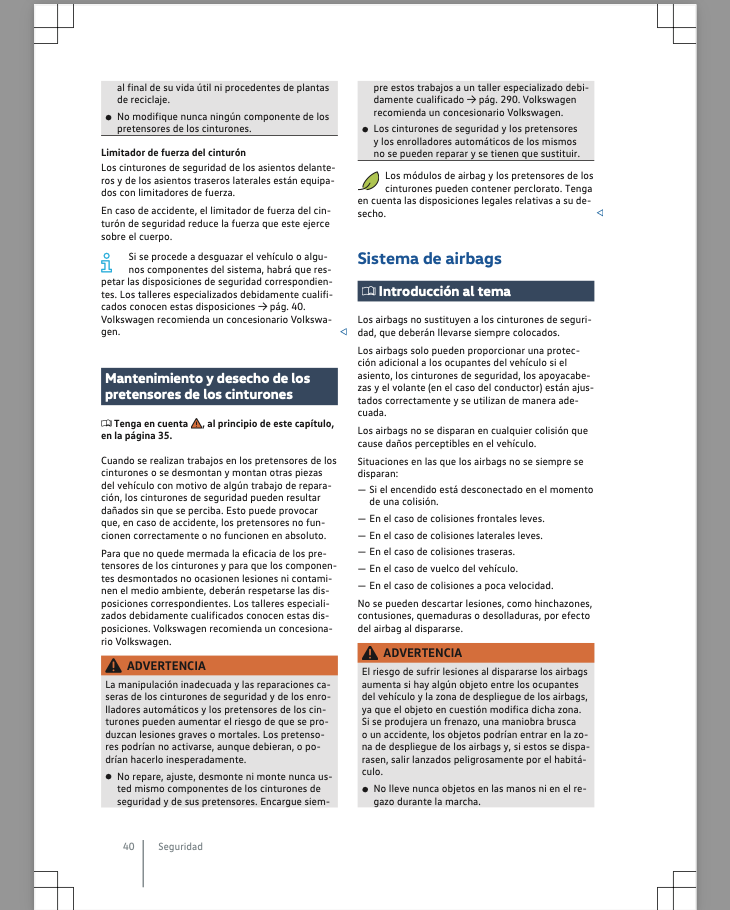
Volkswagen Argentina, for example, delivers cars with a 100% digital manual. No paper at all. Instead, you get a 300-page PDF, heavy, designed for a laptop, and practically impossible to navigate from a phone.
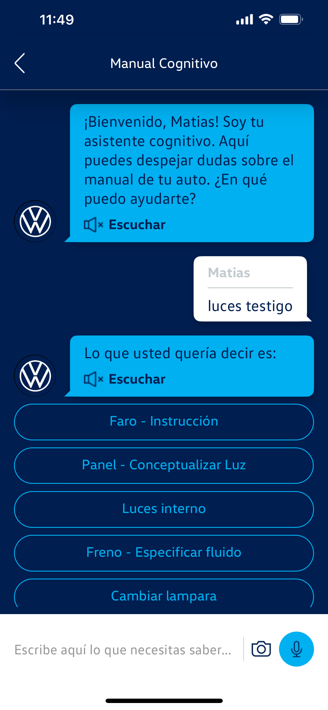
The car’s multimedia system also includes a “cognitive manual”, a name that sounds like science fiction. But it doesn’t work offline, and when it does connect, it responds with the accuracy of a sleeping parrot. There’s also an app with a chatbot that promises assistance, but ends up saying things like “I don’t understand the question” precisely when you need it.
Meanwhile, the old printed manual had one basic virtue: it worked. You opened it, looked for what you needed, and found it. No Wi-Fi, no passwords, no updates — and most importantly, no frustration.
It’s Not the Paper, It’s the Design
The problem isn’t “digital.” The problem is how the digital is designed.
There’s nothing more modern than something well made. Waze replaced paper maps and no one misses them. Digital boarding passes work better than cardboard ones. Movie tickets, QR payments… all examples of technology that understands its context of use and simplifies life.
Volkswagen’s digital manual doesn’t fail because it’s digital. It fails because it was conceived as a copy of the paper version, not as a new experience. And that’s the most common mistake in digital transformation: believing that “putting it in the cloud” means redesigning it.
Context Also Designs
A manual is part of the product. And if the product changes, the way you use it changes too. A user trying to identify a dashboard light doesn’t want to read 300 pages. They want a quick, clear answer, accessible from their phone, even offline. Designing that isn’t about making a prettier PDF — it’s about understanding what’s happening on the other side of the screen.
Technology can do wonders, but without empathy it breaks the experience instead of enhancing it. Digital cannot afford to ignore the basics: context, need, moment.
The Illusion of Innovation
Many brands still believe that “digitizing” is synonymous with innovating. But innovation without understanding is just decoration. Design must be functional, not merely formal. And that goes for a car manual, an app, or an e-commerce site.
Because when digital doesn’t understand the problem, it ends up replicating the limitations of analog — but with more steps, more passwords, and more frustration. The user doesn’t miss paper; they miss things simply working.
Modernity with Criteria
The best innovations aren’t the ones that destroy what came before, but the ones that improve what already worked. Designing digital experiences isn’t about translating analog processes — it’s about reinterpreting them with intention, understanding how, when, and why they’re used. True modernity isn’t about eliminating paper. It’s about designing with care, with empathy, and with one simple question: Does this make someone’s life better, or does it just digitize it?


